
A Three-Piece Typography Starter Kit
Being that most of our written communication is comprised of type, I think it behooves just about everybody to get a little basic break down of typography. Understanding just a few principles can really help you to make your presentations, agendas or your family's holiday update letter to feel more professional and to look nicer. It's not just about looking sleek: paying attention to your type can actually help you to get your points across more clearly. Better still, everything I'm going to talk about you can do in Microsoft Word. Best of all, I won't even get all completely technical type-nerdy on you.
My starter kit for killer typography boils down to just three umbrella rules: 1. Be Context Aware 2. Create Contrast 3. Go Simple So ditch the 12-point Times New Roman and let's try something fun!
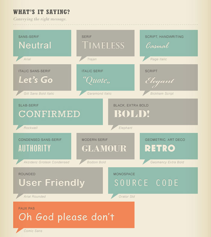
1. Be Context Aware The most important thing to recognize in selecting a font is how it will be used and what message the words in that font will impart. Consider the level of impact you want each item to have, what sort of mood you want to convey. This infographic section has a pretty simple breakdown of different categories of fonts (or typefaces, if you do want to get technical).
Another thing to be aware of is readability. Always make sure to set body copy in a legible, clean font. Serif fonts are generally easier to read for lengthy bodies of text, which explains why most books are set in serif fonts. However, for any broken-up text boxes or block-text the length of – oh-let's-just-say – a cover letter, a crisp sans serif can also make a legible and engaging impact. Furthermore, people tend to err on the side of picking fonts that are larger than necessary. Twelve-point is kind of a default in Word, but when printing, I almost never print body copy at more than 10-point, frequently going as small as 7-point or 8-point (it helps to add a bit of space between lines to increase legibility). If your body text is that small, you probably don't need huge headings either–just enough difference to be understood as different types of information. The rules are a little different on screen though; things need to be a bit bigger, which usually means using type that that's about the size you would normally expect to use anyway.
2. Go Simple There are loads of resource sites (Check out Font Squirrel, Google Fonts, and The League of Moveable Type for starts.) where you can get free fonts that range from highly practical and useful additions to your library, to exciting-and-fun fonts that can look a bit ridiculous if overused. Don't overdo it; be sparing with all the crazy-cool decorative fonts to punch up the overall feel of whatever you're making. Think of decorative fonts like neon: a great fashion accent, but it takes a real fashionista with a wild streak to pull off a whole outfit. For example, the largest headers or the title work well with creative fonts being that they are short and surrounded by extra space, but I wouldn't recommend applying them to subheadings–that can get overpowering and illegible (and for the love of Eric Gill, never set paragraphs in script).
The key point of maintaining simplicity is to limit yourself to two or (as needed) three typefaces in a document. One to two of these should typically be very utilitarian and legible, while the other can be a little more expressive in terms of mood. If you don't know what to think about a particular font, search up some reviews. Designers are typically very vocal online, sharing resources and opinions steadily.
3. Create Contrast
The last step is to consider how to create variety in your document. It's helpful to establish something of a hierarchy of information. Different parts are assigned different levels of importance or relate to different elements. The best way to differentiate and help readers quickly ascertain what relationships exist between different pieces of written information is to use different fonts. Think of all the different types of information you might have: headers, subheaders, body, contact info, captions, quotes, time schedules– it's a lot of different things. But didn't I just caution against using more than 2-3 typefaces? Well, sure, but it's all about how you treat them.
A single typeface, particularly a good one, has a lot of breadth. You can use it in all capitals or small caps; italic or bold. Many typefaces have ultra-light or ultra-black weights in their indexes. Capitalize on them! As always, size and scale are other ways to create contrast within a document, but if you can treat the scale with more subtlety and work different weights and complimentary type pairings instead, you'll find you have a more sophisticated final product. When choosing your typefaces, the trick is too make sure that they not only aren't too similar, but that they also compliment each other. Usually, pairing a sans serif and a serif will work in your favor, but there are some handy pairing guides (here, here, and also here) that I've enjoyed and made use of to help you start. It's a commonly held belief that typography is such a utilitarian element of communication that it doesn't necessarily need to be original so much as it needs to be good. So feel free to seek out and employ precedents. A final helpful way to create contrast is to find different ways of breaking up text. Use columns or pull quotes to add variety to your reader's flow. As we all know, nobody really likes to look at long monotonous documents so the more points of interest, the easier to engage people with content(cue the guffaws at my ultimate failure to provide such things in this post).
Now if you've made it this far, you're basically qualified to take on my internship (That's everything: my entire design BA in a blog post). If you're nerdy enough to still be curious, check this out because it will make you smarter and cooler almost immediately. I wish you all Garamondspeed in your future day-to-day typographic endeavors.